simply stamps brand identity
A brand identity built around the meaning behind every mark
Brand Strategy / Visual Identity / Art Direction / Brand Voice
Simply Stamps needed an identity that could unite a wide range of products, customers, and use cases under one recognizable idea. The system was developed around the belief that a stamp is more than a functional tool. It can represent identity, ownership, encouragement, organization, creativity, and trust. The resulting brand brings a legacy stamp company into a more expressive and human visual world while preserving the clarity, reliability, and expertise customers depend on.
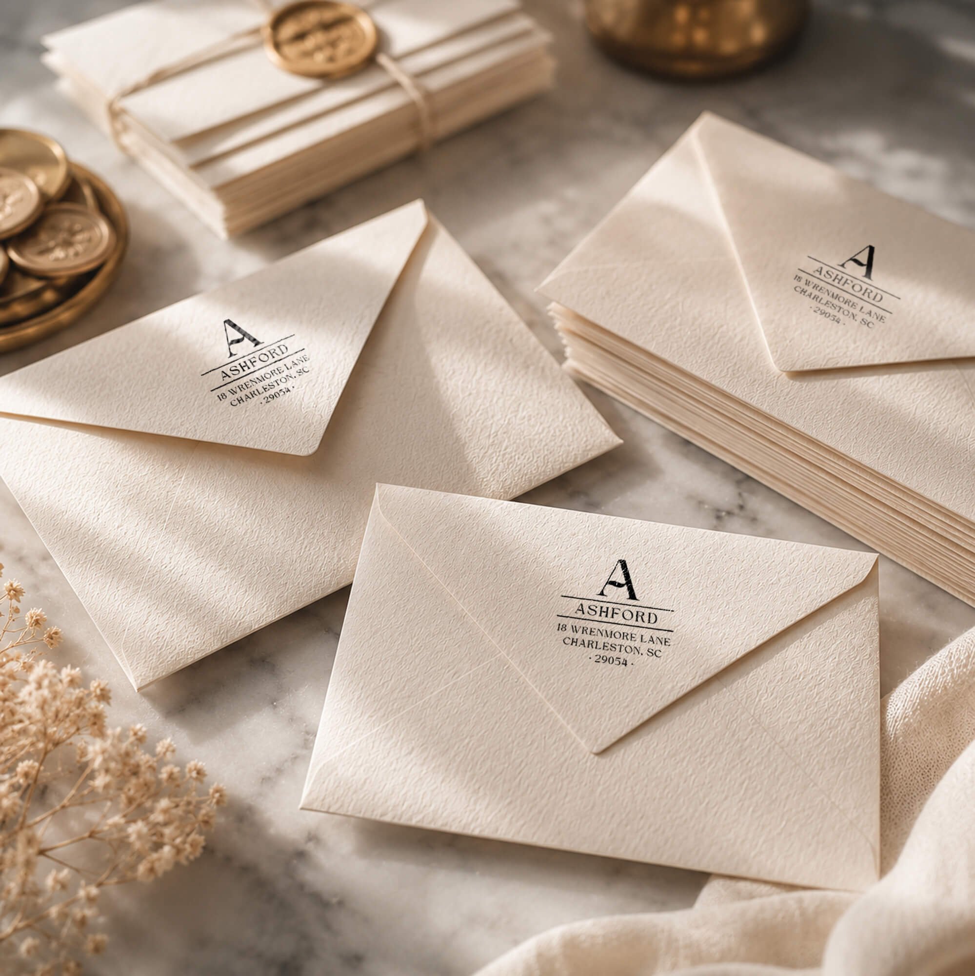
brand foundation
Simply Stamps was reimagined around a simple belief: every mark carries meaning. The brand foundation connects decades of stamp making expertise with a more human and expressive identity, balancing trust, clarity, and utility with the creativity and purpose behind every impression.
-
Simply Stamps helps people create marks that carry meaning. Whether someone is identifying their home, building a business, organizing an office, encouraging a student, or personalizing something they made, each impression represents something worth recognizing.
-
Decades of stamp making expertise are paired with the speed and flexibility of modern ecommerce. The brand offers deep customization, dependable production, fast fulfillment, and products designed for both personal expression and everyday function.
-
Clear, confident, helpful, and expressive. Simply Stamps should feel like an experienced maker who understands the technical details but remains approachable, excited, and invested in what the customer is creating.
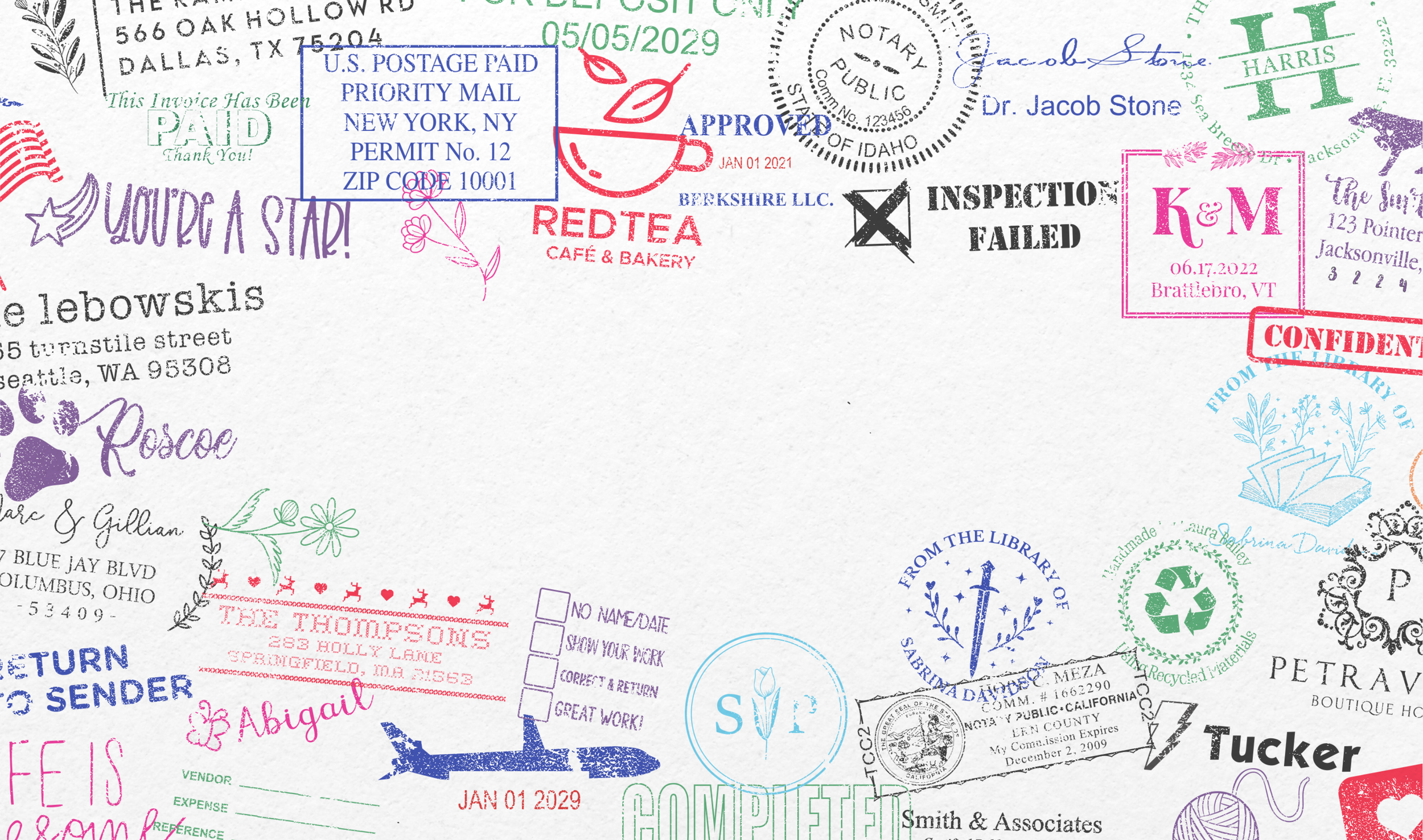
your mark matters
A stamp may be small, but what it represents is not.
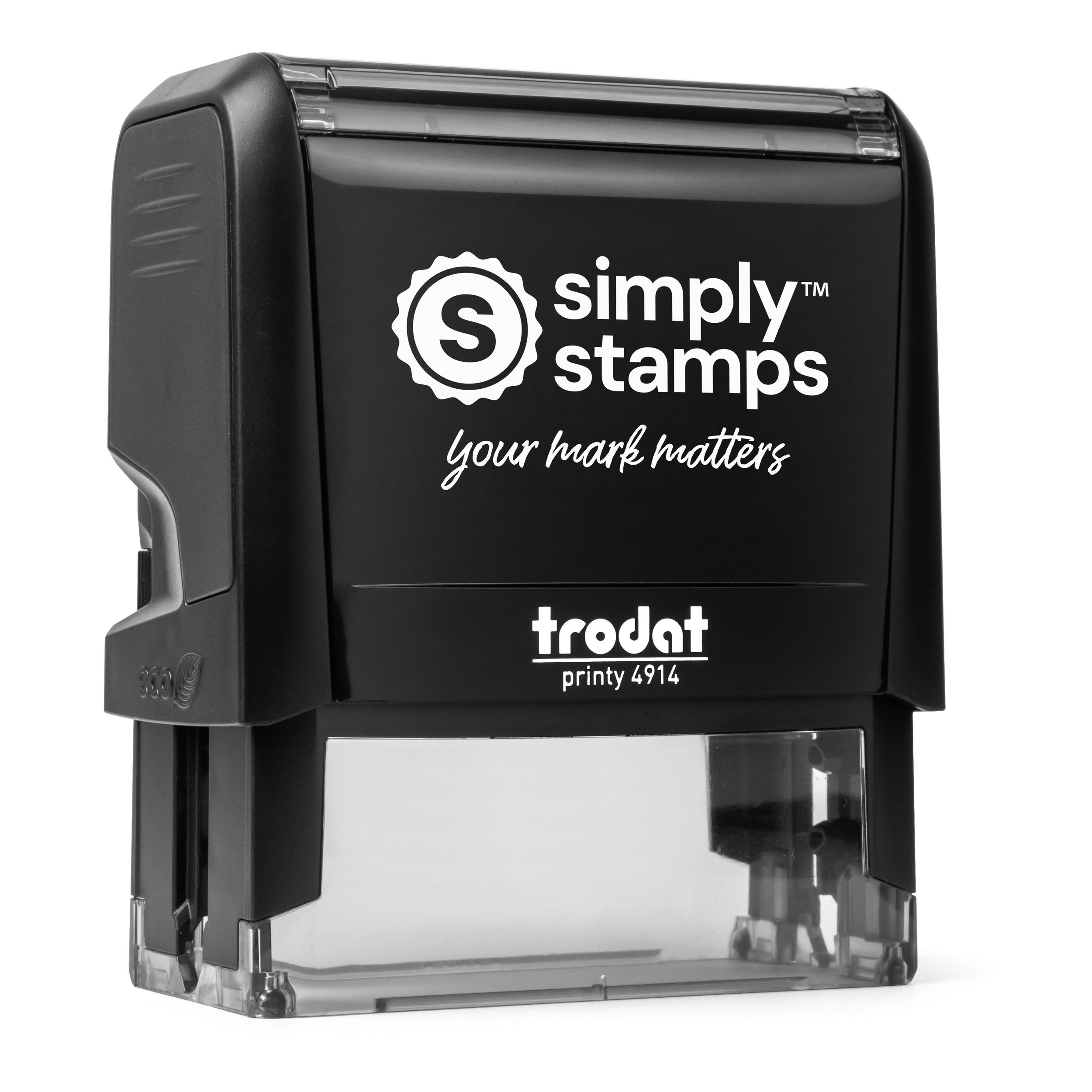
Simply Stamps is built on the belief that a mark can carry identity, trust, pride, and encouragement. The brand turns that idea into a clear and expressive system, connecting the meaning behind every impression with the speed, reliability, and craftsmanship customers expect. From the stamp body to the final mark, every detail is designed to feel personal, purposeful, and unmistakably Simply Stamps.
The logo system preserves the recognizable Simply Stamps seal while creating a flexible identity that remains clear and confident across all applications.
logo system

Primary Logo on Light Backgrounds

Primary Logo on Dark Backgrounds

Primary Logo with Tagline

Icon Logo
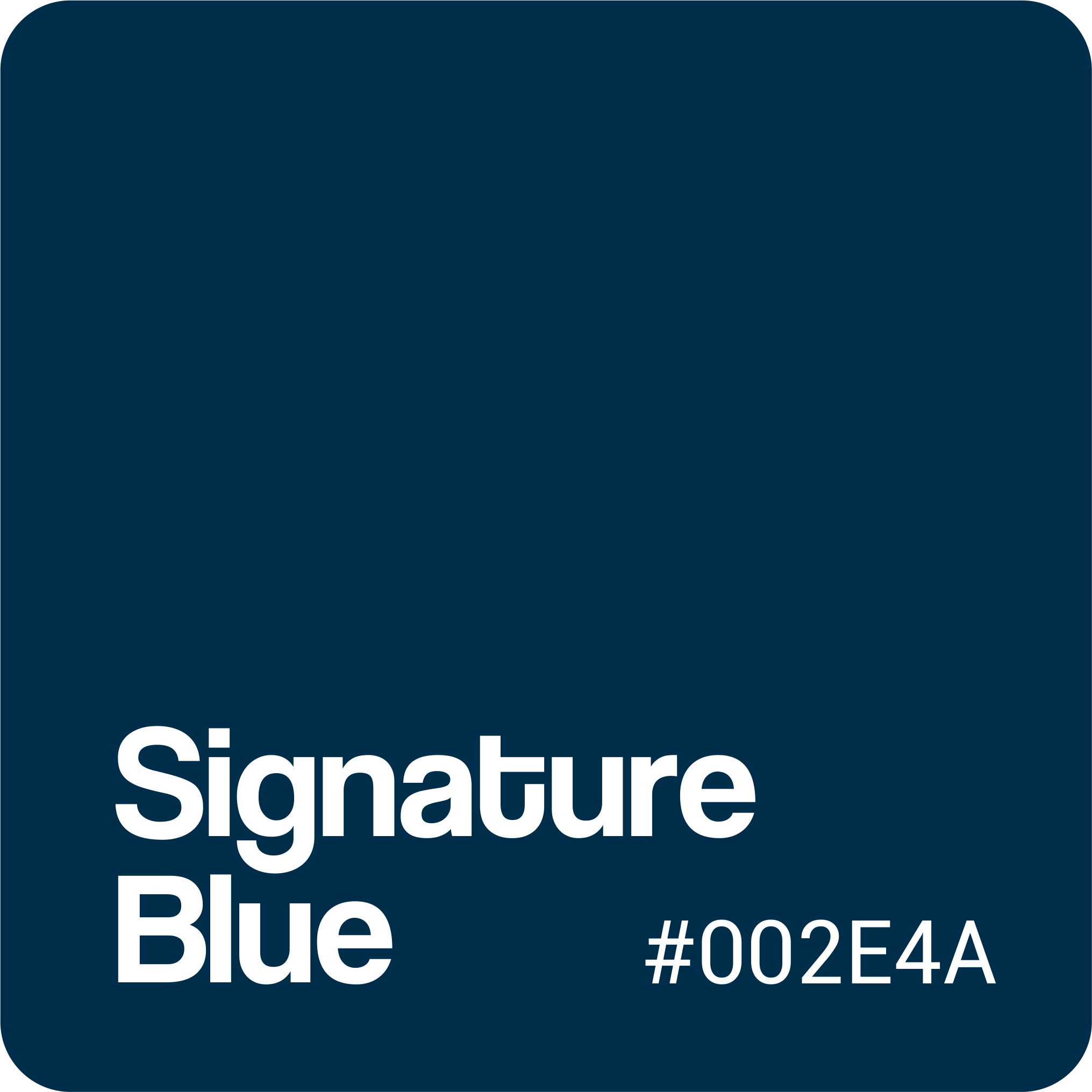
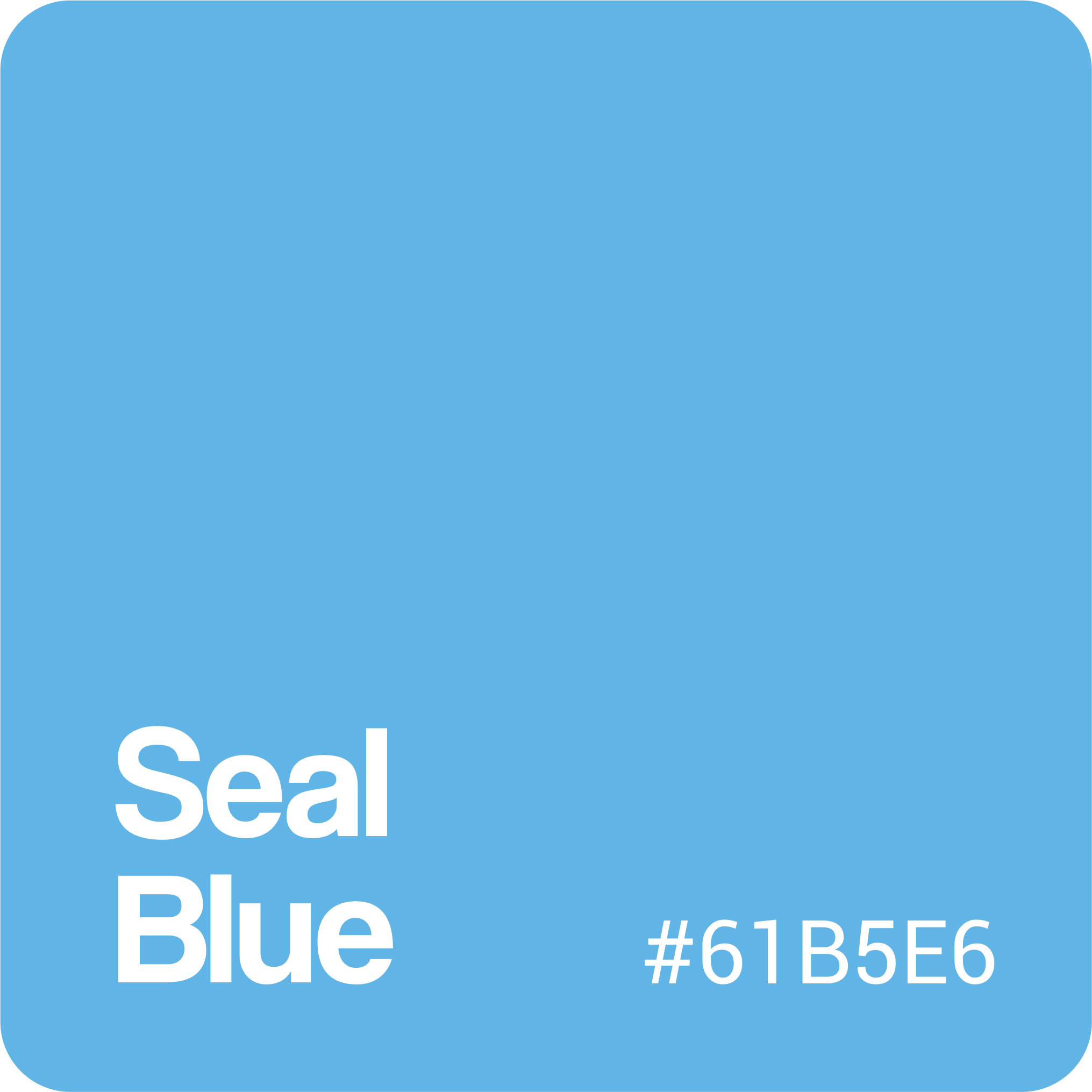
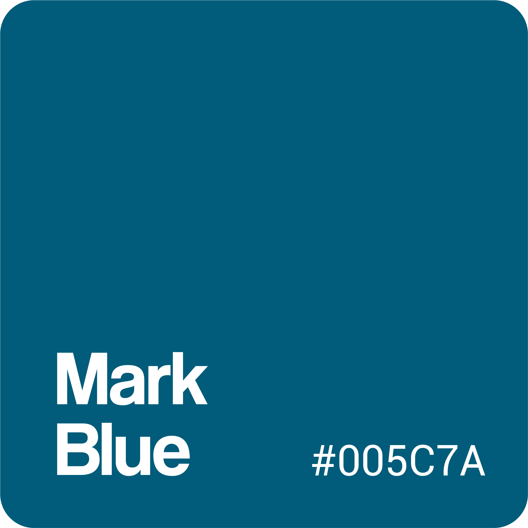
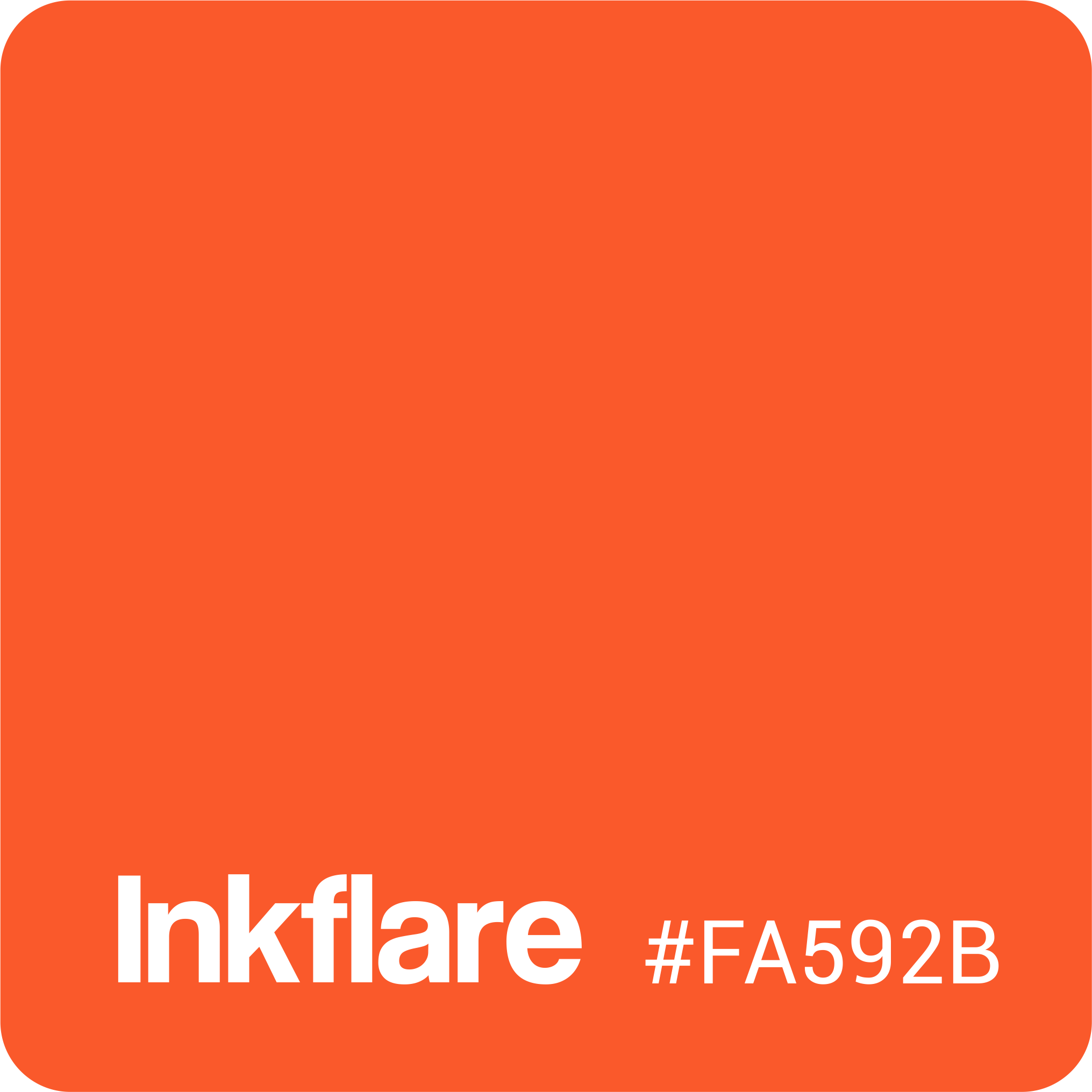
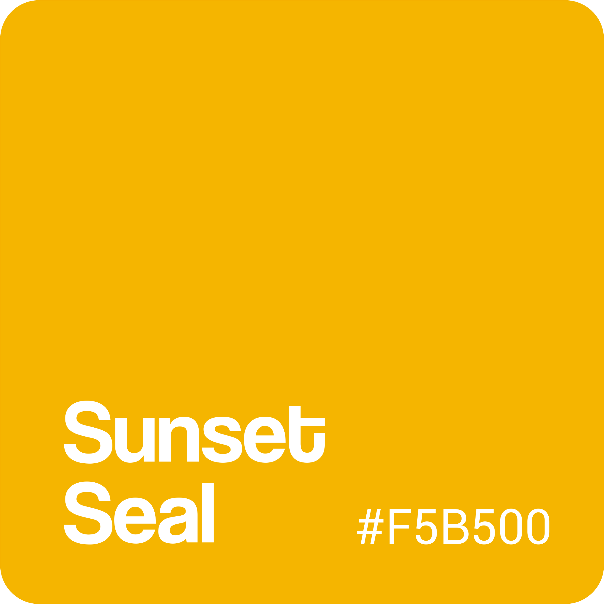
The palette balances the trust and history of Simply Stamps blue with warmer colors that introduce energy, optimism, and human expression. Deep blues provide clarity and authority, while orange and yellow bring contrast and emotional emphasis to important brand moments.
color theory
typography
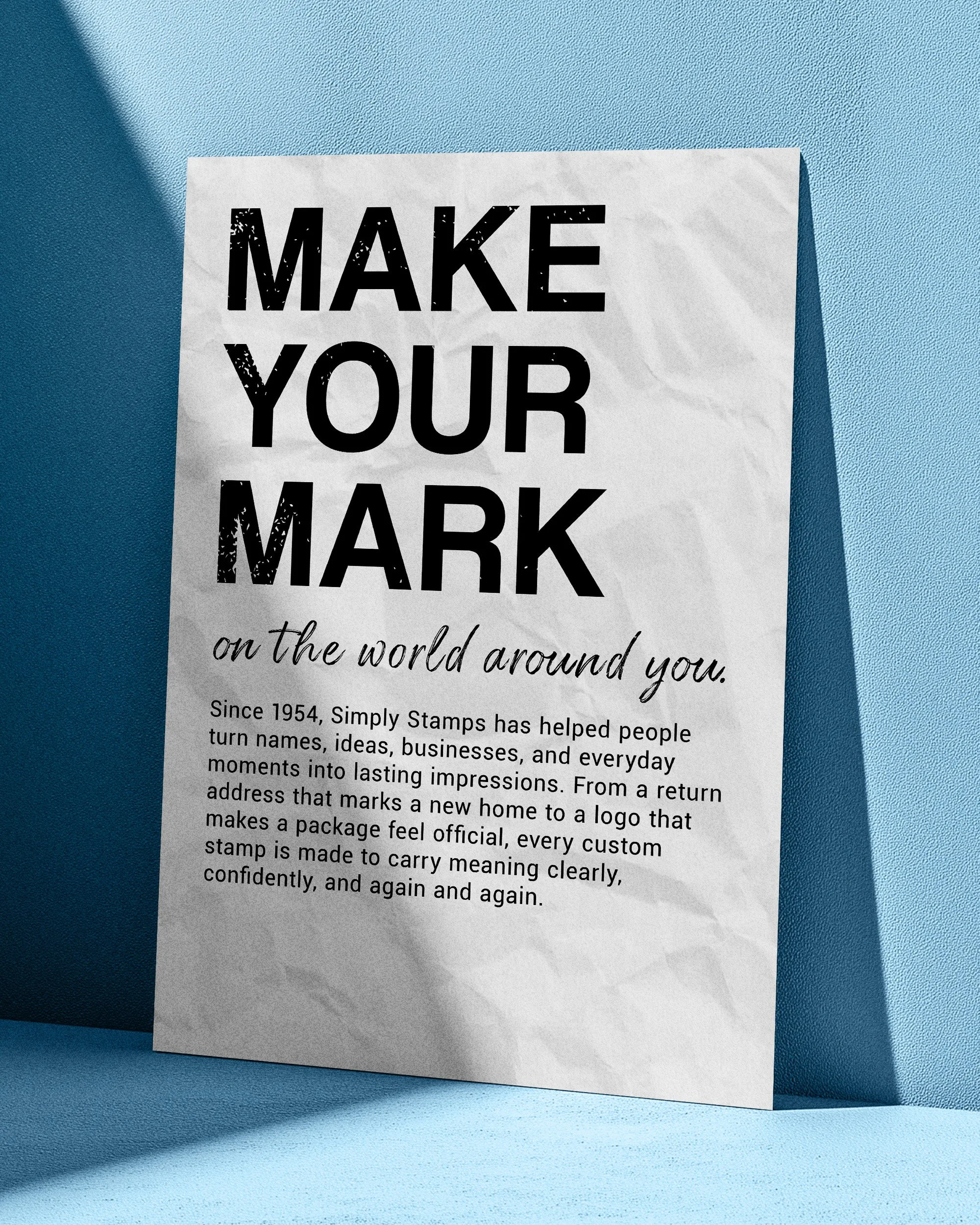
The typography system balances bold personality with practical clarity. Coolvetica gives the brand a confident and recognizable voice across headlines and campaign messaging, while Roboto keeps body copy and digital information clean, approachable, and easy to read. Quartiel adds a more personal, expressive quality to taglines and emotional moments, while Roboto Serif introduces warmth and refinement for select editorial applications. Together, the typefaces allow Simply Stamps to move naturally between functional communication and meaningful storytelling.
The illustration system brings warmth, personality, and movement into the brand through expressive line work and simple recognizable forms. Designed to feel human rather than overly polished, the artwork can function as standalone iconography or expand into complete brand moments across promotional, educational, and storytelling content.
illustration & iconography
The photography system brings the brand into real moments of use. Lifestyle imagery focuses on the people behind each impression, while product, use case, and informational photography provide the clarity customers need to understand and purchase confidently. Together, these image types balance emotional storytelling with practical ecommerce communication.
photography